How To Use Colour To Your Advantage
Painting Quotes
from local painters

Selecting a colour scheme can be an intimidating task. Regardless of whether you’re painting a single door or kitting out your entire home with matching red polka-dot linen, it’s naturally stressful to be making decisions about something which will have such a significant impact on the feel and look of your home. It doesn’t help that there are literally millions of shades and paint samples out there. So how what’s the best way to go about finding an interior colour scheme?
How colour works

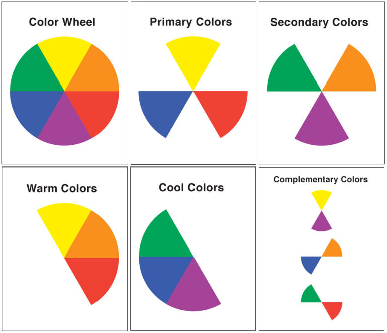
Let’s get back to primary school basics - you’ve got primary and secondary colours, the latter being made up from some combination of the former. The physiological response of the eye to light allows us to primarily perceive wavelengths which correspond to red, yellow and blue (there is some disagreement over whether green constitutes a primary colour). You may find a colour wheel helpful in assembling your colour scheme. Although finding colours you like can be quite instinctual, and very much a process of trial-and-error, it may also help to get advice from hardware staff or trades professionals - there are also plenty of resources online.
Creating a good scheme means creating an aesthetically-pleasing selection of hues in various intensities which will bring out a certain look from your home. The basic colour scheme is monochromatic - that is, featuring all of the shades of one singular colour. Monochromatic schemes are great for small units and apartments, which may appear too busy with a more complex scheme and too monotonous with simple creams and whites. Alternatively, your scheme may incorporate a set of complementary colours, which are technically called as such for their ability to cancel each other out to an achromatic hue but also simply look effective together. Most colour schemes will involve a base neutral, such as beige, white or cream, and perhaps two hues. For a slightly stronger look, go for either a cool or warm combination of analogous colours (colours which sit next to each other on the wheel, usually one primary and the two adjacent). If you want to really get creative, try a triadic colour scheme, which uses three equally-spaced colours around the wheel. Or you can always go off-book and just pick and choose shades which take your fancy - however, bear in mind that you should always use trial patches since colours can look remarkably different on different surfaces and in different lights.
How to make colour work for you
Colour can have a huge impact on the appearance of a space. If you don’t want to take any risks, go for an old favourite like black and white or white and blue. The most important thing to remember - so important it almost goes without saying - is that light colours will usually make a room feel more spacious. When you’re working with small spaces, like children’s bedrooms or apartment kitchens, it can be frustrating to constantly find yourself comparing infinite samples of practically-indistinguishable white. Highlighting coloured accessories in these areas, such as furniture, appliances and light fittings, will make them feel more personal. One of the most impressive painting projects to try in a larger living space is the feature wall (though the feature ceiling is also starting to gain a little ground - pun intended). Bold colours or patterned wallpaper make excellent features. Of course, you may also be interested in looking into colour psychology, which deals with the possible emotional effects of colour in the home - for instance, it has been suggested that red increases appetite, hence its frequent use in fast food branding, and blue is commonly used in bathrooms to evoke images of cleanliness and nature. Finally, a colour scheme is most certainly not just about paint - remember to incorporate furniture, homewares, lighting, decoration and materials, such as wood or wrought iron.
Here are some examples of colour being used to excellent effect in specific consideration of the shape and dimensions of the space available.
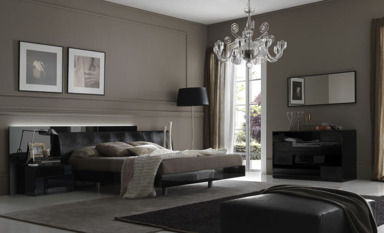
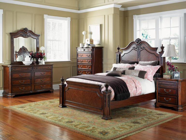
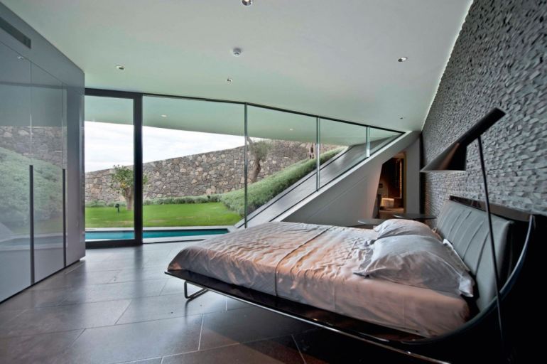
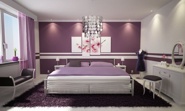
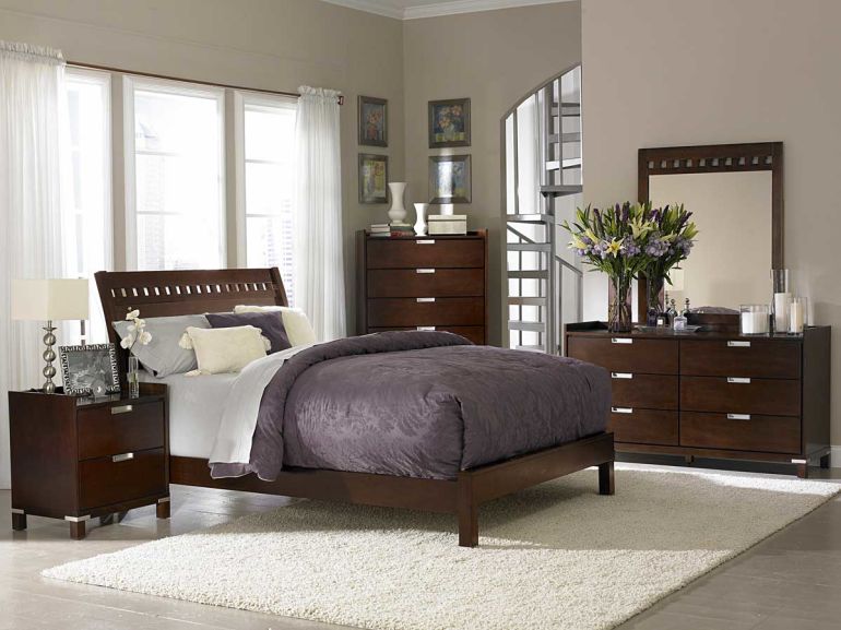
Focus: bedroom
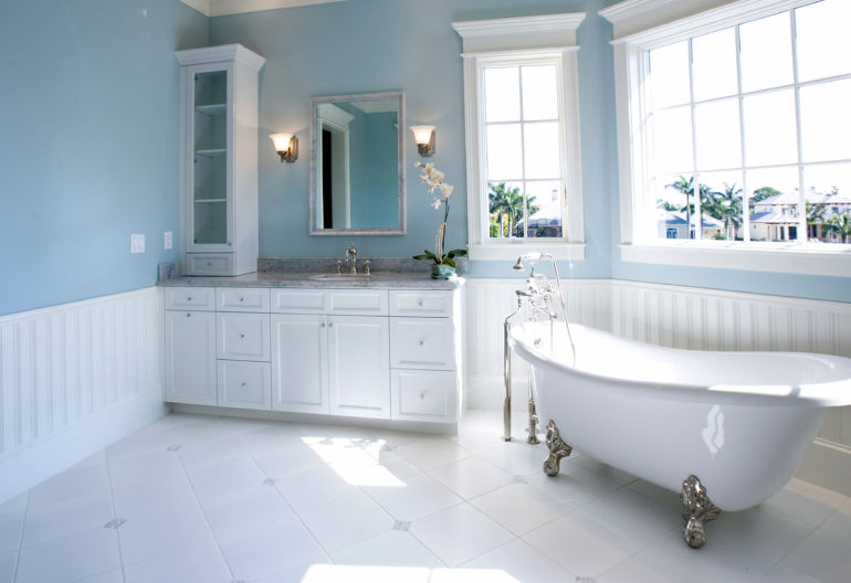
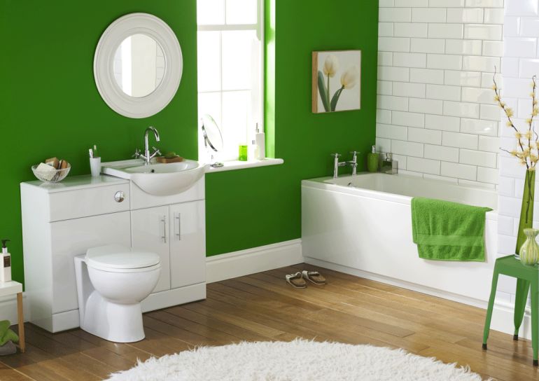
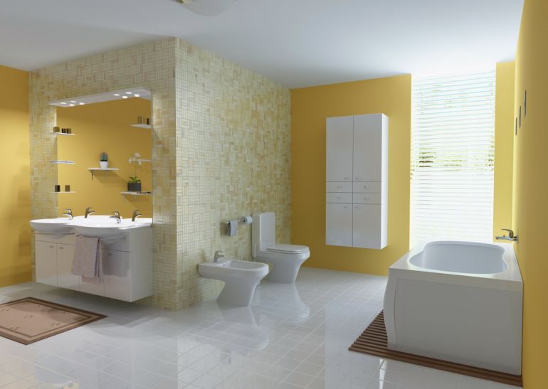
Focus: bathroom

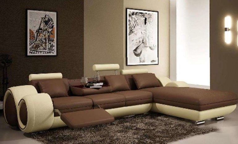
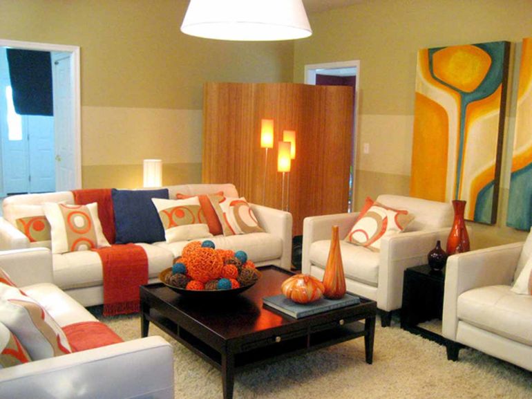
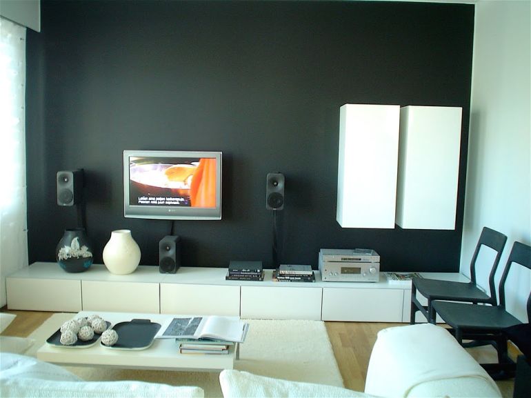
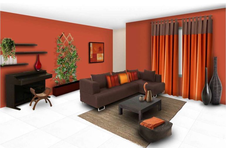
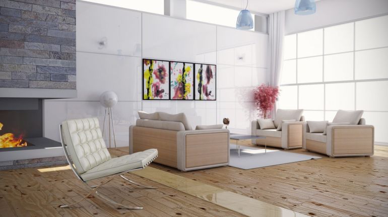
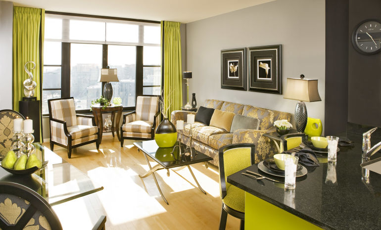
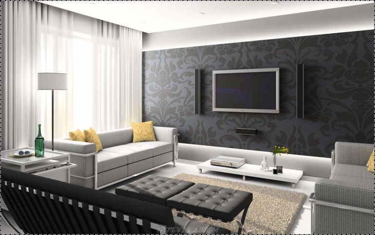
Focus: living room
Need a hand with your painting? Service Central has plenty of qualified tradespeople here to help. Just post your job to receive three free no-obligation quotes from local professions!
Painting Quotes
from local painters
![]()